
The Shopify e-commerce platform is a vast and multi-faceted one. Its architecture addresses all aspects of a business conducted online and no detail is overlooked; however, there were Usability shortcomings which made my experience less than satisfying.
With the intention of making a great product better, I’ve conducted a brief analysis of the tools, processes and screens which slowed my progress.
For those who are unfamiliar, Usability (Use-ability) “is a quality attribute that assesses how easy user interfaces (websites) are to use. The word also refers to methods for improving ease-of-use during the design process.”
![]() This definition belongs to Usability guru Jakob Nielsen’s of the Nielsen Norman Group. For a more thorough explanation, you may refer to his firm’s website.
This definition belongs to Usability guru Jakob Nielsen’s of the Nielsen Norman Group. For a more thorough explanation, you may refer to his firm’s website.
Personally, I’ve been studying Usability since the mid-90s and was introduced to Neilson’s work in 1997. His books detail research findings over a span of many years. I’ve purchased 3 of them, then integrated my newfound knowledge into client websites – with impressive results: my customer’s sites were chosen over their competition because they were easier to use.
Preface
Issues will be addressed using screen captures followed by recommendations.
Analysis:
My primary difficulties were:
- Learning how to use the site
- User orientation: where am I?
- Lapses in instructional continuity
- Confusing wording and processes, and an
- Absence of help in the form of questions or suggestions on pages
Combined, these factors lead to my re-tracing my steps back and forth across the software; essentially, I was lost.
Example 1: User Orientation
After downloading the Supply theme, it first presents itself in outline form. The top line “Online Store/Themes” (see below) is what is known as a ‘breadcrumb trail’ and it serves as a means of navigation. It tells the user what section or area of the site they’re in.

However, should it not read: Online Store / Themes / Supply”? And what is “Launchpad-Star” doing there? Should not ‘Supply theme’ be there instead. (This example was taken from Shopify’s current version and I don’t recall the Launchpad wording being there before.)
Recommendation:
Implement a more detailed ‘breadcrumb trail’ within the site pages so that users can recall where they’ve been and where they are, at all times. An online site map indicating to the store owner, You are “here,” would be a good addition.
Example 2: Lapse in Instructional Continuity: Image Re-Sizer
Because the item images eventually end up on the home page in catalogue form, their size must be standardized. This is the job of Shopify’s Image Re-sizer and the process is comprised of 4 steps with instructions and a mysterious 5th step lacking them. Steps:
- 1. Drag photos into the re-sizing zone where up to 6 of them can be loaded
- 2. Fill out form with an email address and the preferred photo size, then click ‘Submit’

- 3. A re-sized photo appears (not to scale) with a clickable “Download” link underneath it. When it is clicked, another screen appears
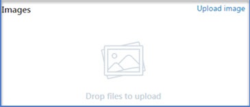
- 4. The image on the left appears with zero direction as to what to do next.
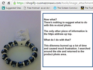
Was I previously in the Product area? I wasn’t sure, but eventually I returned there and re-examined the screen below – which didn’t make sense before. For one thing, there’s a sentence or blurb with opposite direction words: drop & up(load). If “drag” was used in the Image Re-sizer instructions (see Step 1), why is “drop” used now? If the same process is in place, using “drop” introduces inconsistency and therefore, confusion. Is this the goal?
Recommendation for Shopify:
Place the following text to the right of the image:
“To transfer this image into the appropriate product area, click on the coding in the address bar above and either double click it or use CTRL C to copy it
Open up Product area from the Main menu and choose the page the image belongs to. Scroll down to where Image box is and click on Upload Image. Copy coding into the box that presents itself and click Enter. The image will now appear on the appropriate product page.
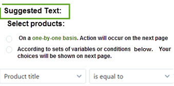
Example 3: Wording and Processes
As I was behind schedule in building my client’s store, I liked the mention of “automatic” anything. However, this screen’s misleading wording baffled me.
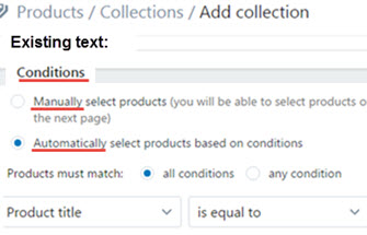
Manual means “involving or using human effort, skill, power, energy, etc.; physical” while Automatic means “having the capability of starting, operating, moving, etc., independently.”
What did “Condition” mean? By now, I was determined to figure this one out on my own and, after a lot of back-and-forth action, I realized this wording was a database directive, not instructions for store owners who maybe didn’t have a background in database work.
I re-wrote the first part the way I understood it but failed to grasp the variables equation in the two columns at the bottom: obviously not for a beginner or for a small application.
Example 4: Absence of Help in the Form of Questions or Suggestions on Pages
Throughout my weeks on the site, I got the impression that an assumption had been built into it by its creators: that I already knew how to use the site or that, eventually, I would get it – and I finally did. But then, another huge problem cropped up.
Is this part of the learning process? Yes, but my ability to grasp and operate the site could have been sped up considerably with the addition of suggestions as to what to do next. Or, even a serious of questions vertically stacked. As an aid to the user, this is good Usability.
For each task in process, such as adding products or determining the optimum size of photographs for the Image Re-sizer, create some questions or make suggestions as to what the store owner should do next.  A visual persona like Sally Shopify, pictured here, could be the helpful guide.
Example 4a
I was informed that the top 3 rows of the Supply theme could slide to the right to accommodate 5 categories of items. Try as I did, I could not make that work. The pleasant Shopify support fellow took some time but figured it out.
Recommendation:
Create guide books for each theme so that the store owner can figure out how to format it according to their needs or desires. This will give them a sense of mastery and control which builds confidence and a positive attitude.